Bootstrap column and row custom component issues

I almost have my Bootstrap column and row controls working in the visual editor. However I have been struggling with a number of minor issues that I can’t seem to overcome. Any help is appreciated. Here is an example of these controls in action…

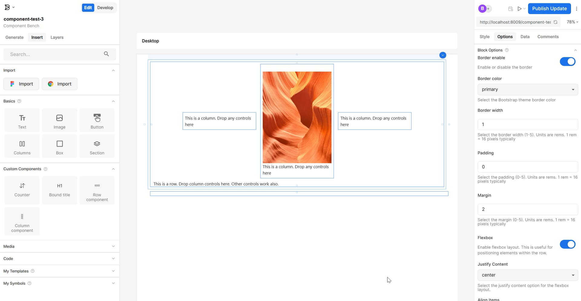
So here is a Bootstrap row dropped in from the custom control menu and 3 Bootstrap columns dropped inside of the row. Then I have dropped an image in the center column. I have the row component selected and you can see in the right hand pane the inputs where I can set the border color and thickness along with the padding, margin and flexbox utilities. This is really starting to look good!

Here are the problems I am facing…

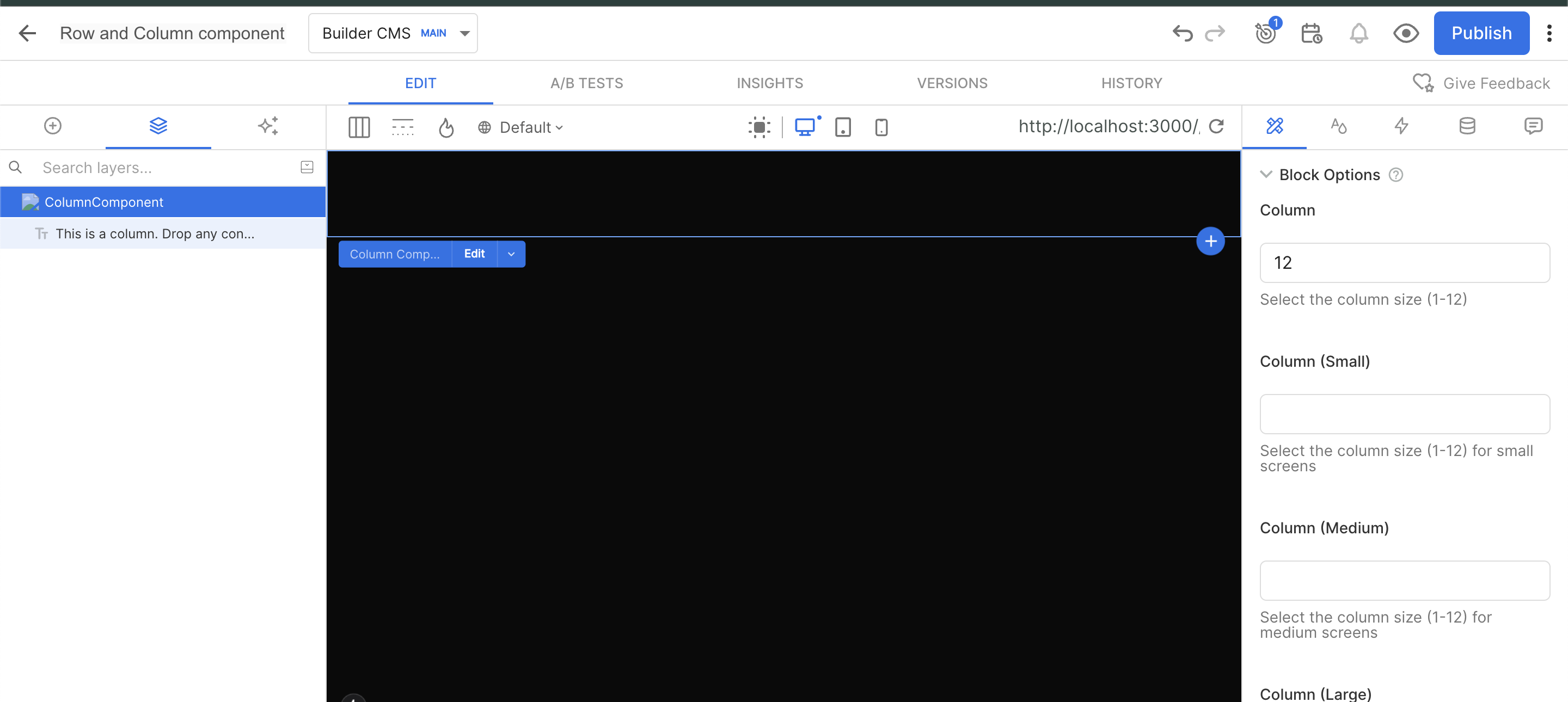
  1. I had to use “noWrap: false” on the column component to make it work right. What I discovered is that when you use noWrap:false, you can no longer select the control in the visual editor. This is a deal breaker because I need to be able to set the bootstrap column classes (col-n, col-sm-n, col-lg-n, etc) to control the layout within the row. How can the noWrap:false components be selected in the visual editor?
  2. I am using a default text component to indicate the position of the row or column controls. Otherwise the row and column controls are invisible without any child controls. This is fine except that when you drop another control in it, I want the default control to be deleted. Of course you can delete it manually but this is really not what I want. How do you do this?

Here is the code for registering my bootstrap column and row components…

Builder.registerComponent(RowComponent, {
  name: "RowComponent",
  noWrap: false,
  inputs: [
    {
      name: 'border',
      friendlyName: 'Border enable',
      helperText: 'Enable or disable the border',
      type: 'boolean',
      defaultValue: true,
    },
    {
      name: 'borderColor',
      friendlyName: 'Border color',
      helperText: 'Select the Bootstrap theme border color',
      type: 'string',
      defaultValue: 'primary',
      enum: ['primary', 'secondary', 'success', 'danger', 'warning', 'info', 'light', 'dark']
    },
    {
      name: 'borderWidth',
      friendlyName: 'Border width',
      helperText: 'Select the border width (1-5). Units are rems. 1 rem = 16 pixels typically',
      type: 'number',
      defaultValue: 1
    },
    {
      name: 'padding',
      friendlyName: 'Padding',
      helperText: 'Select the padding (0-5). Units are rems. 1 rem = 16 pixels typically',
      type: 'number',
      defaultValue: 2
    },
    {
      name: 'margin',
      friendlyName: 'Margin',
      helperText: 'Select the margin (0-5). Units are rems. 1 rem = 16 pixels typically',
      type: 'number',
      defaultValue: 2
    },
    {
      name: 'flexbox',
      friendlyName: 'Flexbox',
      helperText: 'Enable flexbox layout. This is useful for positioning elements within the row.',
      type: 'boolean',
      defaultValue: true,
    },
    {
      name: 'justifyContent',
      friendlyName: 'Justify Content',
      helperText: 'Select the justify content option for the flexbox layout.',
      type: 'string',
      enum: [
        {
          label: '(none)',
          value: ''
        },
        {
          label: 'start',
          value: 'justify-content-start'
        },
        {
          label: 'end',
          value: 'justify-content-end'
        },
        {
          label: 'center',
          value: 'justify-content-center'
        },
        {
          label: 'space between',
          value: 'justify-content-between'
        },
        {
          label: 'space around',
          value: 'justify-content-around'
        },
        {
          label: 'space around',
          value: 'justify-content-evenly'
        }
      ],
      defaultValue: 'justify-content-center'
    },
    {
      name: 'alignContent',
      friendlyName: 'Align Items',
      helperText: 'Select the align items option for the flexbox layout.',
      type: 'string',
      enum: [
        {
          label: '(none)',
          value: ''
        },
        {
          label: 'start',
          value: 'align-items-start'
        },
        {
          label: 'end',
          value: 'align-items-end'
        },
        {
          label: 'center',
          value: 'align-items-center'
        },
        {
          label: 'baseline',
          value: 'align-items-baseline'
        },
        {
          label: 'stretch',
          value: 'align-items-stretch'
        }
      ],
      defaultValue: 'align-items-center'
    },
    {
      name: 'other',
      friendlyName: 'Other Bootstrap Classes',
      helperText: 'Enter other bootstrap classes where needed.  Separate multiple classes with spaces. Ex: "mt-3 mb-3"',
      type: 'string',
      defaultValue: ''
    }
  ],
  canHaveChildren: true,
  defaultChildren: [
    {
      '@type': '@builder.io/sdk:Element',
      component : {
        name: 'Text',
        options: {
          text: 'This is a row. Drop column controls here.  Other controls work also.'
        }
      }
    }
  ],
  image: "http://localhost:8009/grip-horizontal.svg",
});

Builder.registerComponent(ColumnComponent, {
  name: "ColumnComponent",
  noWrap: true,
  inputs: [
    {
      name: 'col',
      friendlyName: 'Column',
      helperText: 'Select the column size (1-12)',
      type: 'number',
      defaultValue: 12
    },
    {
      name: 'colSm',
      friendlyName: 'Column (Small)',
      helperText: 'Select the column size (1-12) for small screens',
      type: 'number',
      defaultValue: null
    },
    {
      name: 'colMd',
      friendlyName: 'Column (Medium)',
      helperText: 'Select the column size (1-12) for medium screens',
      type: 'number',
      defaultValue: null
    },
    {
      name: 'colLg',
      friendlyName: 'Column (Large)',
      helperText: 'Select the column size (1-12) for large screens',
      type: 'number',
      defaultValue: null
    },
    {
      name: 'colXl',
      friendlyName: 'Column (Extra Large)',
      helperText: 'Select the column size (1-12) for extra large screens',
      type: 'number',
      defaultValue: null
    },
    {
      name: 'border',
      friendlyName: 'Border enable',
      helperText: 'Enable or disable the border',
      type: 'boolean',
      defaultValue: true,
    },
    {
      name: 'borderColor',
      friendlyName: 'Border color',
      helperText: 'Select the Bootstrap theme border color',
      type: 'string',
      defaultValue: 'primary',
      enum: ['primary', 'secondary', 'success', 'danger', 'warning', 'info', 'light', 'dark']
    },
    {
      name: 'borderWidth',
      friendlyName: 'Border width',
      helperText: 'Select the border width (1-5). Units are rems. 1 rem = 16 pixels typically',
      type: 'number',
      defaultValue: 1
    },
    {
      name: 'padding',
      friendlyName: 'Padding',
      helperText: 'Select the padding (0-5). Units are rems. 1 rem = 16 pixels typically',
      type: 'number',
      defaultValue: 2
    },
    {
      name: 'margin',
      friendlyName: 'Margin',
      helperText: 'Select the margin (0-5). Units are rems. 1 rem = 16 pixels typically',
      type: 'number',
      defaultValue: 2
    },
    {
      name: 'other',
      friendlyName: 'Other Bootstrap Classes',
      helperText: 'Enter other bootstrap classes where needed.  Separate multiple classes with spaces. Ex: "mt-3 mb-3"',
      type: 'string',
      defaultValue: ''
    }
  ],
  canHaveChildren: true,
  defaultChildren: [
    {
      '@type': '@builder.io/sdk:Element',
      component : {
        name: 'Text',
        options: {
          text: 'This is a column. Drop any controls here'
        }
      }
    }
  ],
  image: "http://localhost:8009/grip-vertical.svg",
});

Hello @AQuirky

For the first issue, I noticed that you’re using noWrap: true in your column component:

Builder.registerComponent(ColumnComponent, 
  name: "ColumnComponent",
  noWrap: true,
  inputs: [
    // ...
  ],
});

In your JSX, are you ensuring that the component is rendering the classes properly? For example:

className={`my-class ${props.attributes.className}`}

This will make sure any classes passed through Builder are applied correctly.

Hello @AQuirky

for the second issue, instead of using default text component, you can use uiBlocks

Here is an example:

Builder.registerComponent(CustomColumns, {
  name: 'DynamicColumns',
  canHaveChildren: true,
  inputs: [
    {
      name: 'columns',
      type: 'list',
      defaultValue: [
        { blocks: [] },
        { blocks: [] }
      ],
      subFields: [
        {
          name: 'blocks',
          type: 'uiBlocks',
          defaultValue: {
            blocks: [],
          },
        },
      ],
    },
    {
      name: 'gap',
      type: 'string',
      defaultValue: '20px',
      helperText: 'Gap between columns (e.g., 20px, 1rem)',
    },
    {
      name: 'columnWidth',
      type: 'string',
      enum: [
        { label: 'Equal Width', value: 'equal' },
        { label: 'Auto Width', value: 'auto' },
        { label: 'Custom Width', value: 'custom' },
      ],
      defaultValue: 'equal',
      helperText: 'How columns should be sized',
    },
  ],
  childRequirements: {
    message: 'You can drag and drop any components here to create column content',
    query: {},
  },
}); 
"use client";
import { 
  Builder, 
  BuilderBlocks, 
  type BuilderElement 
} from '@builder.io/react';

// Define the component
type ColumnData = {
  blocks: BuilderElement[];
};

type BuilderProps = {
  columns: ColumnData[];
  builderBlock: BuilderElement;
};

const CustomColumns = (props: BuilderProps) => {
  const columns = props.columns || [];
  
  return (
    <div style={{ display: 'flex', gap: '20px', width: '100%' }}>
      {columns.map((column, index) => (
        <div key={index} style={{ flex: 1 }}>
          <BuilderBlocks
            parentElementId={props.builderBlock.id}
            dataPath={`columns.${index}.blocks`}
            blocks={column?.blocks || []}
          />
        </div>
      ))}
    </div>
  );
};

// Register with Builder
Builder.registerComponent(CustomColumns, {
  name: 'DynamicColumns',
  canHaveChildren: true,
  inputs: [
    {
      name: 'columns',
      type: 'list',
      defaultValue: [
        { blocks: [] },
        { blocks: [] }
      ],
      subFields: [
        {
          name: 'blocks',
          type: 'uiBlocks',
          defaultValue: {
            blocks: [],
          },
        },
      ],
    },
    {
      name: 'gap',
      type: 'string',
      defaultValue: '20px',
      helperText: 'Gap between columns (e.g., 20px, 1rem)',
    },
    {
      name: 'columnWidth',
      type: 'string',
      enum: [
        { label: 'Equal Width', value: 'equal' },
        { label: 'Auto Width', value: 'auto' },
        { label: 'Custom Width', value: 'custom' },
      ],
      defaultValue: 'equal',
      helperText: 'How columns should be sized',
    },
  ],
  childRequirements: {
    message: 'You can drag and drop any components here to create column content',
    query: {},
  },
});

export default CustomColumns;

When using uiBlocks you will see “+ Add block” option in the editor.

Let us know if above doesn’t solve the issue for you!

Thanks ,

Hi manish-sharma,

No luck with the first issue. Here is the code for my column component…

"use client";
import React from "react";
import type { PropsWithChildren } from "react";
import { Builder, withChildren } from "@builder.io/react";
import { Col } from "react-bootstrap";

interface ColumnComponentProps extends PropsWithChildren {
    col?: number,
    colSm?: number,
    colMd?: number,
    colLg?: number,
    colXl?: number,
    borderColor?: string;
    borderWidth?: number;
    border?: boolean;
    padding?: number;
    margin?: number;
    other?: string;
    attributes?: any;
}

const ColumnComponent: React.FunctionComponent<ColumnComponentProps> = (
    props
) => {
  let classNames = '';
  if (props.col) {
    classNames += `col-${props.col} `;
  }
  if (props.colSm) {
    classNames += `col-sm-${props.colSm} `;
  }
  if (props.colMd) {
    classNames += `col-md-${props.colMd} `;
  }
  if (props.colLg) {
    classNames += `col-lg-${props.colLg} `;
  }
  if (props.colXl) {
    classNames += `col-xl-${props.colXl} `;
  }
  if (props.border) {
    classNames += `border border-${props.borderColor} border-${props.borderWidth} `;
  }
  if (props.padding || props.padding === 0) {
    classNames += `p-${props.padding} `;
  }
  if (props.margin || props.margin === 0) {
    classNames += `m-${props.margin} `;
  }
  if (props.other) {
    classNames += `${props.other} `;
  }
  classNames = classNames.trim();
  console.log('Builder classNames:', props.attributes.className);
  return (
      <Col className={`${props.attributes.className} ${classNames}`}>
        {props.children}
      </Col>
  );
};
export default withChildren(ColumnComponent);

The output from the console log…

Builder classNames: builder-block builder-404e543bfcc04b13990810f817782169 builder-has-component css-qc0lp8

I noticed in your post you put the builder class names after the local class names, but in the post you referenced, it says to put the builder class names before the local class names. I tried it both ways. Neither worked. The column component cannot be selected.

Hello @AQuirky

The console.log output appears to show the correct Builder classes, which should allow the component to be selected within the editor. Could you please share the Builder content link where you are testing this?

Thank you

@AQuirky
It seems to be selectable when using the Builder preview URL. Are you experiencing the issue when working on localhost or on your production domain?

I created a component using your code, but I’m still not able to reproduce the issue on my end. Adding ${props.attributes.className} seems to work correctly and allows selecting the component with noWrap: true.

Well that is very interesting. I see that also. If I don’t use the preview URL, I can select the column component. I can’t imagine what the preview URL is doing to defeat the selection. After all I can select all the other custom components that are wrapped in div’s. I removed all the bootstrap classes in the Column component and replaced them with div’s, but still same effect.

I’m also struggling with the second issue solution. I see the “Add Block” button now in my row component, but when I use it the element is not added as a child but below the row component…

So here is the RowV2 component code…

"use client";
import React from "react";
import type { PropsWithChildren } from "react";
import { Builder, withChildren, BuilderBlocks, type BuilderElement } from "@builder.io/react";
import { Row } from "react-bootstrap";

interface RowV2ComponentProps {
    borderColor?: string;
    borderWidth?: number;
    border?: boolean;
    padding?: number;
    margin?: number;
    flexbox?: boolean;
    justifyContent?: string;
    alignContent?: string;
    other?: string;
    childElements?: BuilderElement[];
    builderBlock: BuilderElement;
}

const RowV2Component: React.FunctionComponent<RowV2ComponentProps> = (
    props
) => {

  let classNames = '';
  if(props.flexbox) {
    classNames += 'd-flex ';
    if(props.justifyContent) {
      classNames += props.justifyContent + ' ';
    }
    if(props.alignContent) {
      classNames += props.alignContent + ' ';
    }
  }
  if(props.border) {
    classNames += `border border-${props.borderColor} border-${props.borderWidth} `;
  }
  if(props.padding || props.padding === 0) {
    classNames += `p-${props.padding} `;
  }
  if(props.margin || props.margin === 0) {
    classNames += `m-${props.margin} `;
  }
  if(props.other) {
    classNames += `${props.other} `;
  }
  classNames = classNames.trim();
  return (
      <Row className={`${classNames}`}>
        <BuilderBlocks
          parentElementId={props.builderBlock.id}
          dataPath={`childElements.blocks`}
          blocks={props.childElements}
        />
      </Row>
  );
};
export default RowV2Component;

Note that this doesn’t follow your solution exactly since I don’t need multiple columns. I just need a problem to drop components. So my solution more closely follows this example from the documentation…

import { BuilderBlocks, type BuilderElement } from '@builder.io/react';

type BuilderProps = {
  column1: BuilderElement[];
  column2: BuilderElement[];
  builderBlock: BuilderElement;
};

const CustomColumns = (props: BuilderProps) => {
  return (
    <>
      <BuilderBlocks
        parentElementId={props.builderBlock.id}
        dataPath={`column1.blocks`}
        blocks={props.column1}
      />
      <BuilderBlocks
        parentElementId={props.builderBlock.id}
        dataPath={`column2.blocks`}
        blocks={props.column2}
      />
    </>
  );
};

export default CustomColumns;

That example is from this page: Adding Children to Custom Components

Unfortunately that example does not show the corresponding registration code. So that code looks like this…

```

Builder.registerComponent(RowV2Component, {
  name: "RowV2Component",
  inputs: [
    {
      name: 'border',
      friendlyName: 'Border enable',
      helperText: 'Enable or disable the border',
      type: 'boolean',
      defaultValue: true,
    },
    {
      name: 'borderColor',
      friendlyName: 'Border color',
      helperText: 'Select the Bootstrap theme border color',
      type: 'string',
      defaultValue: 'primary',
      enum: ['primary', 'secondary', 'success', 'danger', 'warning', 'info', 'light', 'dark']
    },
    {
      name: 'borderWidth',
      friendlyName: 'Border width',
      helperText: 'Select the border width (1-5). Units are rems. 1 rem = 16 pixels typically',
      type: 'number',
      defaultValue: 1
    },
    {
      name: 'padding',
      friendlyName: 'Padding',
      helperText: 'Select the padding (0-5). Units are rems. 1 rem = 16 pixels typically',
      type: 'number',
      defaultValue: 2
    },
    {
      name: 'margin',
      friendlyName: 'Margin',
      helperText: 'Select the margin (0-5). Units are rems. 1 rem = 16 pixels typically',
      type: 'number',
      defaultValue: 2
    },
    {
      name: 'flexbox',
      friendlyName: 'Flexbox',
      helperText: 'Enable flexbox layout. This is useful for positioning elements within the row.',
      type: 'boolean',
      defaultValue: true,
    },
    {
      name: 'justifyContent',
      friendlyName: 'Justify Content',
      helperText: 'Select the justify content option for the flexbox layout.',
      type: 'string',
      enum: [
        {
          label: '(none)',
          value: ''
        },
        {
          label: 'start',
          value: 'justify-content-start'
        },
        {
          label: 'end',
          value: 'justify-content-end'
        },
        {
          label: 'center',
          value: 'justify-content-center'
        },
        {
          label: 'space between',
          value: 'justify-content-between'
        },
        {
          label: 'space around',
          value: 'justify-content-around'
        },
        {
          label: 'space around',
          value: 'justify-content-evenly'
        }
      ],
      defaultValue: 'justify-content-center'
    },
    {
      name: 'alignContent',
      friendlyName: 'Align Items',
      helperText: 'Select the align items option for the flexbox layout.',
      type: 'string',
      enum: [
        {
          label: '(none)',
          value: ''
        },
        {
          label: 'start',
          value: 'align-items-start'
        },
        {
          label: 'end',
          value: 'align-items-end'
        },
        {
          label: 'center',
          value: 'align-items-center'
        },
        {
          label: 'baseline',
          value: 'align-items-baseline'
        },
        {
          label: 'stretch',
          value: 'align-items-stretch'
        }
      ],
      defaultValue: 'align-items-center'
    },
    {
      name: 'other',
      friendlyName: 'Other Bootstrap Classes',
      helperText: 'Enter other bootstrap classes where needed.  Separate multiple classes with spaces. Ex: "mt-3 mb-3"',
      type: 'string',
      defaultValue: ''
    },
    {
      name: 'childElements',
      type: 'list',
      defaultValue: [],
      subFields: [
        {
          name: 'blocks',
          type: 'uiBlocks',
          hideFromUI: true,
        },
      ],
    },
  ],
  image: "http://localhost:8009/grip-horizontal.svg",
});

Note the “childElements” input with the “uiBlocks” subfield.

@AQuirky

For the second issue, try using canHaveChildren: true

Builder.registerComponent(CustomColumns, {
  name: 'DynamicColumns',
  canHaveChildren: true,
  inputs: [

Let us know how that works for you!

Thanks,

So manish-sharma, what about some good news? Don’t we both deserve it?

I implemented V3 of the Row component based on the Dynamic tabs example in the documentation and it is working great!

So I drop RowV3 on the editor canvas and then I can add columns in the right panel. All the column component properties are available, so I can set both column and row properties and add components to each column.

This is not what I wanted, but it is good enough**
**
So here is the code for the RowV3…

```

"use client";
import React from "react";
import type { PropsWithChildren } from "react";
import { Builder, withChildren, BuilderBlocks, type BuilderElement } from "@builder.io/react";
import { Row, Col } from "react-bootstrap";
import RowV2Component from "./RowV2";

interface RowV3ComponentProps {
    borderColor?: string;
    borderWidth?: number;
    border?: boolean;
    padding?: number;
    margin?: number;
    flexbox?: boolean;
    justifyContent?: string;
    alignContent?: string;
    other?: string;
    columns?: { col: number; blocks: React.ReactNode[] }[];
    builderBlock: BuilderElement;
}

const RowV3Component: React.FunctionComponent<RowV3ComponentProps> = (
    props
) => {

  let classNames = '';
  if(props.flexbox) {
    classNames += 'd-flex ';
    if(props.justifyContent) {
      classNames += props.justifyContent + ' ';
    }
    if(props.alignContent) {
      classNames += props.alignContent + ' ';
    }
  }
  if(props.border) {
    classNames += `border border-${props.borderColor} border-${props.borderWidth} `;
  }
  if(props.padding || props.padding === 0) {
    classNames += `p-${props.padding} `;
  }
  if(props.margin || props.margin === 0) {
    classNames += `m-${props.margin} `;
  }
  if(props.other) {
    classNames += `${props.other} `;
  }
  classNames = classNames.trim();
  return (
      <Row className={`${classNames}`}>
        { props?.columns?.map((column, index) => (
            <Col key={index} className={`col-${column.col}`}>
              <BuilderBlocks
                  parentElementId={props.builderBlock.id}
                  dataPath={`columns.${index}.blocks`}
                  blocks={column.blocks}
              />
            </Col>
        ))}
      </Row>
  );
};
export default RowV3Component;

The component registration…

```

Builder.registerComponent(RowV3Component, {
  name: 'RowV3Component',
  inputs: [
    {
      name: 'columns',
      type: 'list',
      defaultValue: [],
      subFields: [
        {
          name: 'col',
          friendlyName: 'Column',
          helperText: 'Select the column size (1-12)',
          type: 'number',
          defaultValue: 12
        },
        {
          name: 'blocks',
          type: 'uiBlocks',
          hideFromUI: true,
          defaultValue: [],
        },
      ],
    },
  ],
});

@AQuirky

That’s definitely some good news — and yes, I think we both deserve it! :tada:

I’m glad to hear that implementing V3 of the Row component based on the Dynamic Tabs example is working well for you. It’s great that you’re now able to drop RowV3 onto the editor canvas, add columns from the right panel, and configure both row and column properties while still being able to add components within each column. Even if it’s not exactly what you initially had in mind, it sounds like a solid solution.

So now, the only remaining issue is selecting the column component in the editor when using noWrap: true.

Could you try creating a simple component with noWrap: true, add the Builder classes(props.attributes.className) to the JSX, and let us know if that works for you?

Still not working. However I found a way to get it to work.

So I added a simple horizontal line component…

"use client";
import * as React from "react";

interface HorizontalLineProps {
    attributes?: any;
}

const HorizontalLine: React.FunctionComponent<HorizontalLineProps> = (props) => {
//   return (
//     <hr className="my-4" {...props.attributes} />
//   );
  return (
    <hr className={`my-4 ${props.attributes.className}`} />
  );
};

export default HorizontalLine;

Here is the registration…

```

Builder.registerComponent(HorizontalLine, {
  name: "HorizontalLine",
  inputs: [],
  image: "http://localhost:8009/hr.svg",
  noWrap: true,
});

So when you add this component to the visual editor, you cannot select it. However! If you use the alternate implementation with the “{…props.attributes}” it does work!

This is not a solution of course for my column component as it complete replaces the existing className attribute. Also when I use this approach for the Column component, I get additional errors…

```

fs.js:4 A props object containing a "key" prop is being spread into JSX:
  let props = {key: someKey, className: ..., style: ..., builder-id: ..., children: ...};
  <Col {...props} />
React keys must be passed directly to JSX without using spread:
  let props = {className: ..., style: ..., builder-id: ..., children: ...};
  <Col key={someKey} {...props} />

Additionally, even after adding the spread attributes, I still cannot select the column component.

So this tells me there is something else needed besides the builder class names.

Hello @AQuirky,

It seems you will also need to pass {...props.attributes} along with ${props.attributes.className}`}

Here is an example:

  <TextField 
    variant={props.variant} 
    {...props.attributes} 
    className={`my-class ${props.attributes.className}`}
   />

Please give it a try and let us know how that works for you!

Best regards,

No, the problem with that approach is that the error in the console window…

fs.js:4 A props object containing a "key" prop is being spread into JSX:
  let props = {key: someKey, className: ..., style: ..., builder-id: ..., children: ...};
  <Col {...props} />
React keys must be passed directly to JSX without using spread:
  let props = {className: ..., style: ..., builder-id: ..., children: ...};
  <Col key={someKey} {...props} />

So I figured out what works…

```

  return (
    <Col
      builder-id={props?.attributes?.['builder-id']}
      className={`${classNames} ${props?.attributes?.className || ''}`} >
      {props.children}
    </Col>
  );

So what is missing is the “builder-id” attribute. In fact if you leave out the additional class attributes, selection still works.

So the documentation is wrong. The attribute that needs to be includes on the no-wrap element is the builder-id attribute.

Hello @AQuirky,

Thank you for sharing the details and your investigation. You’re absolutely correct — the issue with the original approach comes from the key prop being spread into JSX, which React does not allow. Your updated implementation is the correct way to handle it:

return (
  <Col
    builder-id={props?.attributes?.['builder-id']}
    className={`${classNames} ${props?.attributes?.className || ''}`} >
    {props.children}
  </Col>
);

The key detail here is ensuring the builder-id attribute is explicitly included. Without it, selection in the editor will not work as expected. As you noted, even if additional class attributes are omitted, selection still works correctly as long as builder-id is present.

To clarify, our documentation is correct — the builder-id attribute must be included for proper editor functionality. The behavior you observed is specific to how certain component libraries (e.g., Bootstrap, Twilio, etc.) handle and forward props. When reserved React props like key are included in a spread, it can result in unexpected behavior.

We really appreciate you bringing this up, as it highlights an area where we can provide additional guidance for developers working with third-party component libraries.

Thanks,