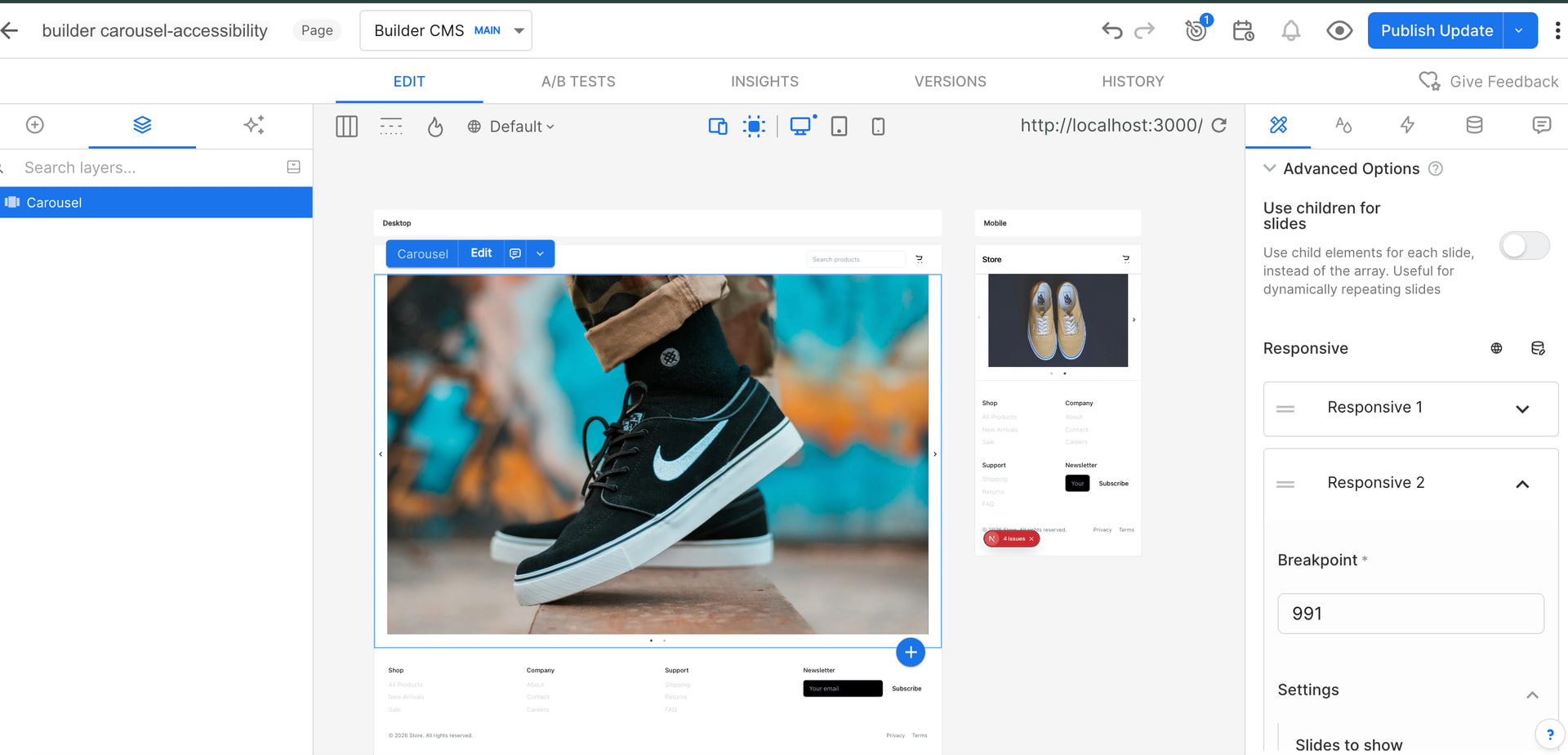
How to use the advance option of carousel to set the break points and show the slides?
My requirement is For 5000 I want 3 slides , for 991 2 slides and for 671 (mobile view ) one slide . How to do that?
Hello @Dhanashree,
To configure the carousel to show different numbers of slides at various breakpoints in Builder.io, you can use the carousel component’s responsive settings. These settings are typically available when you use the Widgets package and can be customized in the Visual Editor. Here’s a general approach:
-
Install the Widgets Package: Make sure you have the Widgets package installed in your Builder project.
-
Add the Carousel Widget:
- Navigate to the Insert tab in the Builder.io Visual Editor.
- Drag and drop the Carousel widget into your design layout.
-
Edit Carousel Settings:
- Click on the Carousel widget in your layout to access the Edit dialogue.
- Look for responsive settings, which will allow you to define how the carousel behaves at different breakpoints.
-
Configure Responsive Settings:
- You’ll need to specify the desired settings for each breakpoint. For the described requirements:
- For widths of 5000px and above, set the carousel to display 3 slides.
- For widths between 991px and 4999px, configure 2 slides.
- For widths of 671px and below, set it to show 1 slide.
- You’ll need to specify the desired settings for each breakpoint. For the described requirements:
If you’re configuring this manually, here is how it can resemble in code using the
react-slick library:
const settings = {
  dots: true,
  infinite: true,
  speed: 500,
  slidesToShow: 1, // default
  responsive: [
    {
      breakpoint: 5000, // For very large screens
      settings: {
        slidesToShow: 3,
      }
    },
    {
      breakpoint: 991, // For medium screens, like tablets
      settings: {
        slidesToShow: 2,
      }
    },
    {
      breakpoint: 671, // For small screens, like phones
      settings: {
        slidesToShow: 1,
      }
    }
  ]
};

// Using in the component
<Slider {...settings}>
  <div>Your Slide Content</div>
  <div>More Slides</div>
  ...
</Slider>
Make sure to check the version of the SDK you are using as the Gen 2 SDKs are still a work in progress for some widgets . If you need to set up breakpoints custom-tailored to your requirements you may need to customize the carousel settings through code within your handles client logic, ensuring these settings are properly included in your Builder project .
Thanks,
@manish-sharma Thanks for replay!
I have tried this approach but didn’t work.
Here is the link of content: Builder.io: AI Frontend Engineer
I am doing this task using builder.io only not using code.
I want simply that for Desktop - 3slides, tab-2 slides, phone-1 slide.
Could please look into this?
Hello @Dhanashree ,
Thanks for the additional details and the link — that helps.
We’ve escalated the breakpoint behavior issue internally with our engineering team for investigation and a possible fix. We agree that configuring different slide counts per device (desktop/tablet/mobile) should work smoothly in the Visual Editor, and we’ll update you as soon as we have progress on this.
In the meantime, here are two practical workarounds you can use:
-
Use custom CSS with media queries to control how many slides appear per breakpoint.
Custom Code in the Visual Editor -
Or create a custom component that accepts slide counts for desktop/tablet/mobile as inputs and handles the responsiveness in code.
Registering Custom Components
Thanks,