Can you make a static custom component which is selectable by content editors to edit fields but cannot be moved nor needs to be dragged and dropped. E.g., There is a page header on every page of a couple page model types, it always lives in the same place, however I want to add some configurable fields on that specific component so they don’t have to live on the page model.
Hello @elir-usafacts,
To create a static custom component in Builder.io that is editable but not movable or draggable, you should use the noWrap option during the component registration. This ensures the component is not wrapped in additional elements by Builder and remains in a fixed location on the page.
Here’s a step-by-step guide to achieve this:
-
Define the Component: Create your React component with configurable fields that content editors can edit.
// MyStaticHeader.tsx import React from 'react'; export const MyStaticHeader = (props: { title: string, description: string }) => { return ( <header> <h1>{props.title}</h1> <p>{props.description}</p> </header> ); }; -
Register the Component with Builder: Use the
noWrapproperty when registering the component so it is not draggable and maintains its static position.import { Builder } from '@builder.io/react'; import dynamic from 'next/dynamic'; Builder.registerComponent( dynamic(() => import('./components/MyStaticHeader')), { name: 'MyStaticHeader', inputs: [ { name: 'title', type: 'string', defaultValue: 'Default Title' }, { name: 'description', type: 'string', defaultValue: 'Default Description' } ], noWrap: true // Ensures it cannot be moved or altered in position } ); -
Integrate the Component: Make sure this component is placed explicitly within your page templates where it needs to be static.
import { MyStaticHeader } from './components/MyStaticHeader';

export default function Page() {
  return (
    <>
      <MyStaticHeader title="Welcome" description="This is the static header." />
      {/* Rest of the page content */}
    </>
  );
}
By setting noWrap: true, the Builder editor will render the component inline without surrounding it with any additional DOM elements, helping maintain its static placement. For more about registerComponent options, you can consult the documentation on component options.
Thanks,
Tried the following:
Static component’s builder file
import dynamic from 'next/dynamic';

import { Builder } from '@builder.io/react';

import { THEME_COLORS } from '@/components/page-banner/page-banner.types';
import { PageType } from '@/types/builder';

Builder.registerComponent(
  dynamic(async () =>
    import('./page-banner').then((module) => module.PageBanner),
  ),
  {
    name: 'PageBanner',
    friendlyName: 'Page Banner',
    noWrap: true,
    hideFromInsertMenu: true,
    inputs: [
      {
        name: 'title',
        type: 'string',
        required: true,
        helperText: 'Main title for the banner',
        showIf: (options) => options.get('model') === PageType.Article,
      },
      {
        name: 'subtitle',
        type: 'string',
        required: false,
        helperText: 'Subtitle for the banner (Article variant only)',
        showIf: (options) => options.get('model') === PageType.Article,
      },
      {
        name: 'htmlTitle',
        type: 'richText',
        required: true,
        helperText:
          'HTML title with picker span.',
        showIf: (options) =>
          options.get('model') === PageType.Answer,
      },
      {
        name: 'pageBanner',
        type: 'object',
        subFields: [
          {
            name: 'pageBannerIcon',
            type: 'pageBannerIconPicker',
          },
          {
            name: 'pageBannerTheme',
            type: 'enum',
            enum: Object.values(THEME_COLORS),
          },
        ],
      },
    ],
    image: 'https://unpkg.com/css.gg@2.0.0/icons/svg/format-heading.svg',
  },
);
And here’s a truncated version of the implementation:
export default function ClientArticlePage({
  content,
  model,
  searchParams,
  apiKey,
}: ClientArticlePageProps) {
  const { useV2Design } = useBrandRefresh('PageBanner');

  return (
    <BuilderContent content={content} model={model} modelName={model}>
      {(data: ArticlePageData, _, fullContent: ArticlePage) => {
        return (
          <main
            className={cn(styles.articlePage, 'border border-hairline-on-grey')}
          >

            {useV2Design ? (
              <PageBanner
                model={model}
                title={data.title}
                description={data.description}
                breadcrumbPages={[{ title: 'Articles', url: indexPageUrl }]}
                currentPage={data.title}
                currentPageUrl={data.url}
                theme={pageBannerValues.theme}
                bannerIcon={pageBannerValues.bannerIcon}
              />
            ) : (
              <></>
            )}
          </main>
        );
      }}
    </BuilderContent>
  );
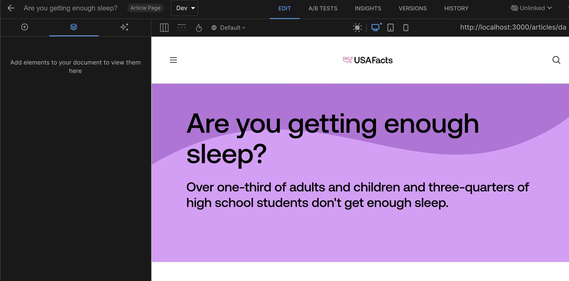
The PageBanner is not clickable at all.
Hello @elir-usafacts,
Yes, when you pass noWrap: true, the component will not be directly clickable—you’ll need to select it from the Layers panel in order to modify its values.
If you’d like to make the noWrap component clickable, you can pass props.attributes in the component JSX. However, please note that doing so will also make the component draggable and droppable:
{...props.attributes}
className={`my-class ${props.attributes.className}`}
You can also reference this related discussion for more context:
Custom component with noWrap true causes focus issue