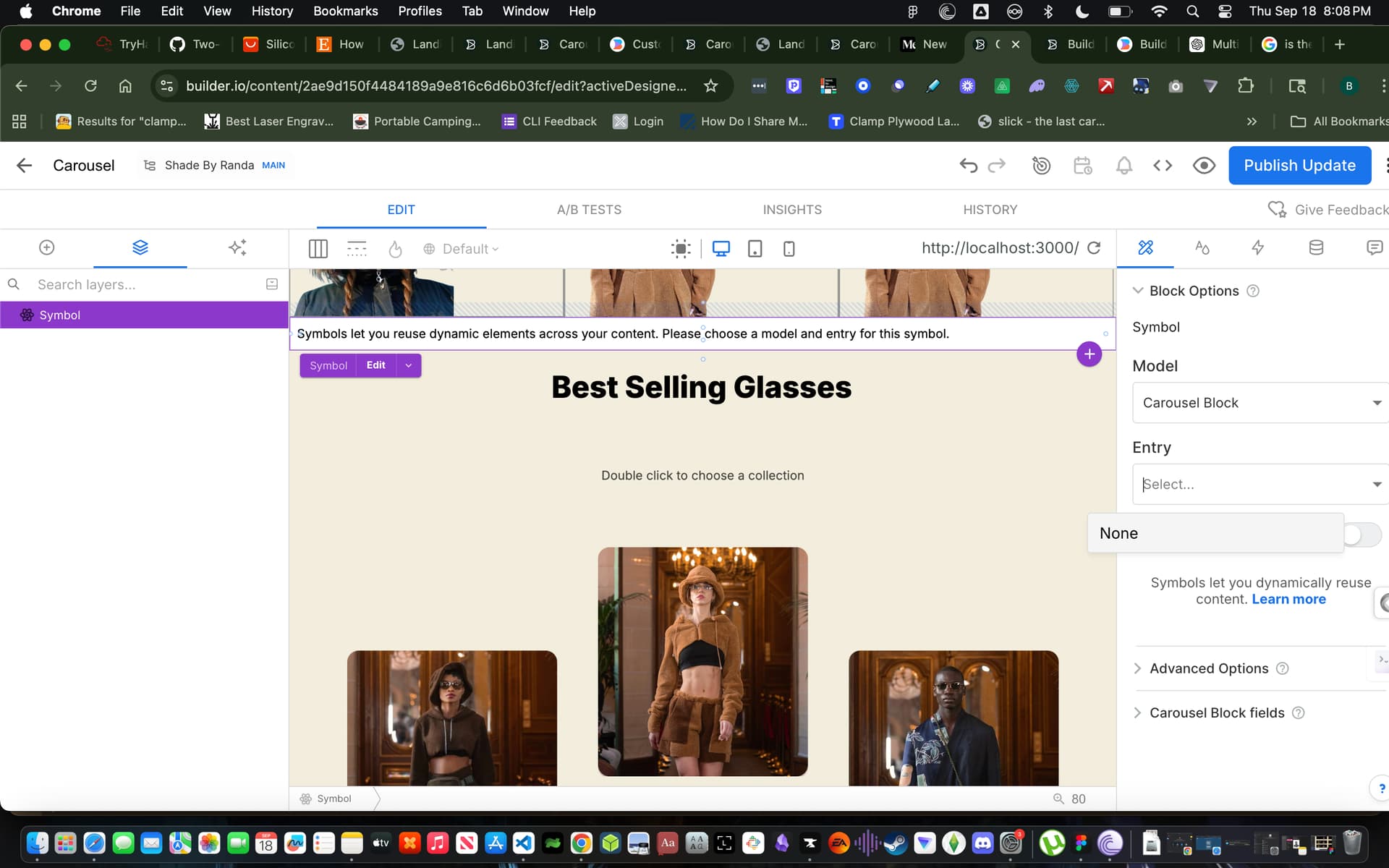
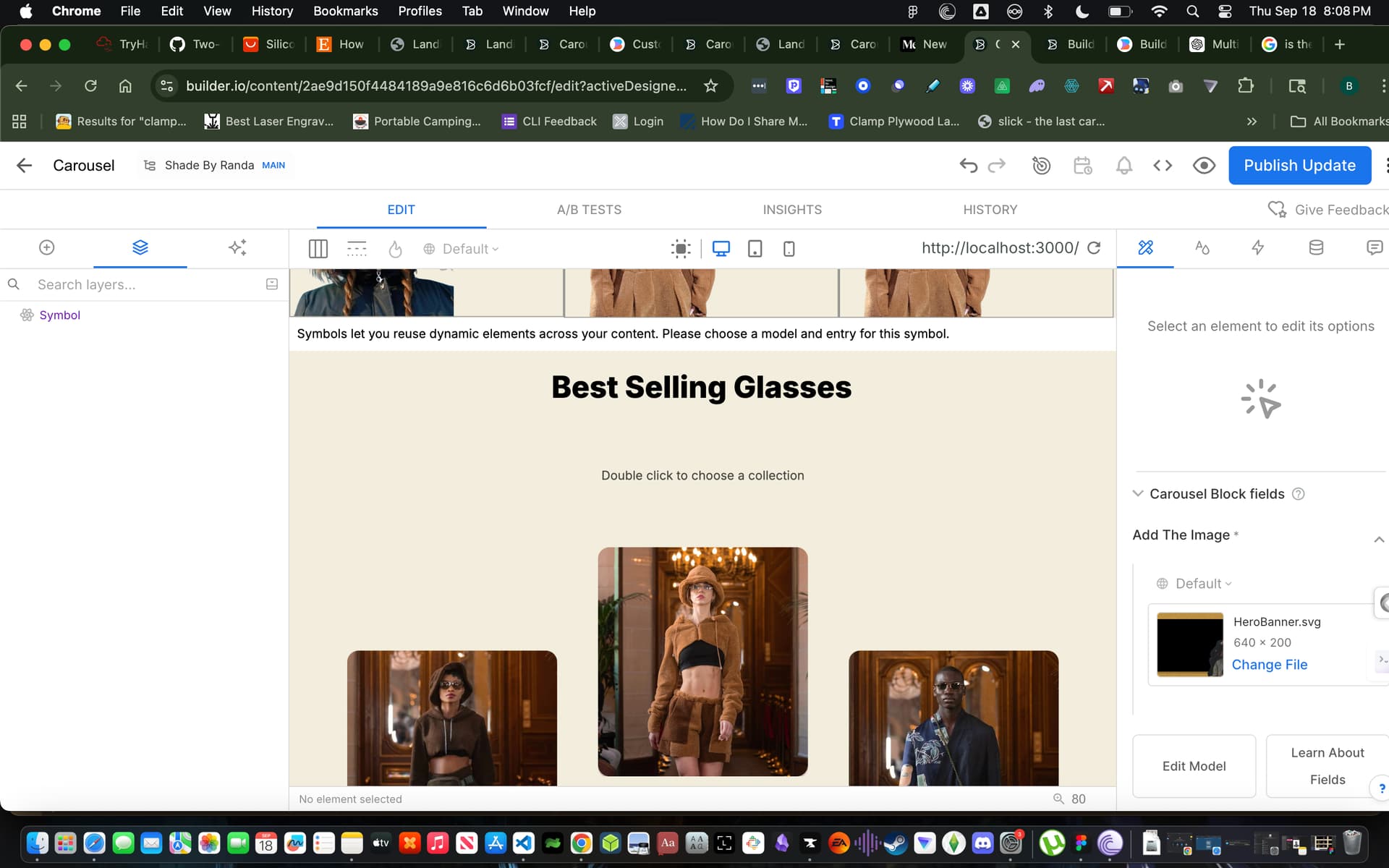
Hello @xbrandonpowell,
It seems you are trying to use section model called carousel-block and adding symbols expecting the carousel prop images to appear for the model, which is not totally wrong, but since you are using Builder.registerComponent it’s going to register a custom component in builder editor that you can directly drag-and-drop from custom component section of visual editor and there is no need to create a new section model or use symbol.
Here is a loom video explaining the issue and possible solutions Carousel | Visual Editor | Builder.io - 19 September 2025 | Loom
Here is an example of carousel component
Builder.registerComponent(Carousel, {
  name: 'Carousel',
  canHaveChildren: true,

  inputs: [
    {
      name: 'useBuilderComponents',
      type: 'boolean',
      defaultValue: false,
      friendlyName: 'Use Manual Slides Mode',
      helperText: 'When enabled, add slide components manually as children. When disabled, use the slides list below.',
    },
    {
      name: 'slides',
      type: 'list',
      showIf: 'options.get("useBuilderComponents") !== true',
      helperText: 'Configure slides with content - each slide will be a container for components',
      defaultValue: [
        {
          slideTitle: 'Slide 1',
          slideContent: [],
        },
        {
          slideTitle: 'Slide 2',
          slideContent: [],
        },
      ],
      subFields: [
        {
          name: 'slideTitle',
          type: 'string',
          defaultValue: 'Slide Title',
          helperText: 'Title for this slide (for reference)',
          localized: true,
        },
        {
          name: 'slideContent',
          type: 'uiBlocks',
          hideFromUI: false,
          defaultValue: {
            blocks: [],
          },
          helperText: 'Drop components here for this slide',
        },
      ],
    },
    {
      name: 'autoplay',
      type: 'boolean',
      defaultValue: false,
      helperText: 'Enable automatic slideshow',
    },
    {
      name: 'autoplaySpeed',
      type: 'number',
      defaultValue: 3000,
      min: 1000,
      max: 10000,
      helperText: 'Autoplay interval in milliseconds',
      showIf: 'options.get("autoplay") === true',
    },
    {
      name: 'showArrows',
      type: 'boolean',
      defaultValue: true,
      helperText: 'Show navigation arrows',
    },
    {
      name: 'showDots',
      type: 'boolean',
      defaultValue: true,
      helperText: 'Show dot indicators',
    },
    {
      name: 'infinite',
      type: 'boolean',
      defaultValue: true,
      helperText: 'Enable infinite loop',
    },
    {
      name: 'slidesToShow',
      type: 'number',
      defaultValue: 1,
      min: 1,
      max: 4,
      helperText: 'Number of slides to show at once',
    },
    {
      name: 'slidesToScroll',
      type: 'number',
      defaultValue: 1,
      min: 1,
      max: 4,
      helperText: 'Number of slides to scroll at once',
    },
    {
      name: 'effect',
      type: 'string',
      enum: [
        { label: 'Slide', value: 'slide' },
        { label: 'Fade', value: 'fade' },
      ],
      defaultValue: 'slide',
      helperText: 'Transition effect between slides',
    },
    {
      name: 'height',
      type: 'string',
      enum: [
        { label: 'Small (200px)', value: 'small' },
        { label: 'Medium (300px)', value: 'medium' },
        { label: 'Large (400px)', value: 'large' },
        { label: 'Extra Large (500px)', value: 'extra-large' },
        { label: 'Full Height (100vh)', value: 'full-height' },
      ],
      defaultValue: 'medium',
      helperText: 'Height of the carousel',
    },
    {
      name: 'pauseOnHover',
      type: 'boolean',
      defaultValue: true,
      helperText: 'Pause autoplay when hovering',
      showIf: 'options.get("autoplay") === true',
    },
    {
      name: 'swipeable',
      type: 'boolean',
      defaultValue: true,
      helperText: 'Enable touch/swipe gestures',
    },
    {
      name: 'speed',
      type: 'number',
      defaultValue: 300,
      min: 100,
      max: 1000,
      helperText: 'Speed of transitions in milliseconds',
    },
    {
      name: 'initialSlide',
      type: 'number',
      defaultValue: 0,
      min: 0,
      helperText: 'Starting slide index',
    },
    {
      name: 'ariaLabel',
      type: 'string',
      defaultValue: 'Carousel',
      helperText: 'Accessibility label for screen readers',
      localized: true,
    },
    {
      name: 'testId',
      type: 'string',
      helperText: 'Test ID for automated testing (optional)',
    },
  ],
  childRequirements: {
    message: 'You can drag and drop any components here to create carousel slides',
    query: {},
  },
});
JSX:
'use client';

import React, { useState, useEffect, useRef, useCallback } from 'react';
import { BuilderBlocks } from '@builder.io/react';


interface CarouselProps {
  useBuilderComponents?: boolean;
  slides?: Array<{
    slideTitle: string;
    slideContent: any[];
  }>;
  builderBlock?: {
    id?: string;
  };
  children?: React.ReactNode;
  autoplay?: boolean;
  autoplaySpeed?: number;
  showArrows?: boolean;
  showDots?: boolean;
  infinite?: boolean;
  slidesToShow?: number;
  slidesToScroll?: number;
  effect?: 'slide' | 'fade';
  height?: 'small' | 'medium' | 'large' | 'extra-large' | 'full-height';
  pauseOnHover?: boolean;
  swipeable?: boolean;
  speed?: number;
  initialSlide?: number;
  className?: string;
  ariaLabel?: string;
  testId?: string;
}

export const Carousel: React.FC<CarouselProps> = ({
  useBuilderComponents = false,
  slides = [],
  builderBlock,
  children,
  autoplay = false,
  autoplaySpeed = 3000,
  showArrows = true,
  showDots = true,
  infinite = true,
  slidesToShow = 1,
  slidesToScroll = 1,
  effect = 'slide',
  height = 'medium',
  pauseOnHover = true,
  swipeable = true,
  speed = 300,
  initialSlide = 0,
  className = '',
  ariaLabel = 'Carousel',
  testId,
}) => {
  const [currentSlide, setCurrentSlide] = useState(initialSlide)
  const [isAutoplayPaused, setIsAutoplayPaused] = useState(false)
  const [isTransitioning, setIsTransitioning] = useState(false)
  const [isDragging, setIsDragging] = useState(false)
  const [dragStart, setDragStart] = useState(0)
  const [dragOffset, setDragOffset] = useState(0)

  const carouselRef = useRef<HTMLDivElement>(null)
  const wrapperRef = useRef<HTMLDivElement>(null)
  const autoplayRef = useRef<NodeJS.Timeout | null>(null)
  const touchStartRef = useRef(0)

  // Determine slide data based on mode
  const slideData = useBuilderComponents ? React.Children.toArray(children) : slides || []
  const totalSlides = slideData.length
  const maxSlide = infinite ? totalSlides : Math.max(0, totalSlides - slidesToShow)

  // Height classes mapping
  const heightClasses = {
    small: 'h-[200px]',
    medium: 'h-[300px]',
    large: 'h-[400px]',
    'extra-large': 'h-[500px]',
    'full-height': 'h-screen',
  };

  // Navigation functions
  const goToSlide = useCallback((index: number) => {
    if (totalSlides === 0) return;

    let newIndex = index;
    if (infinite) {
      if (index < 0) {
        newIndex = totalSlides - 1;
      } else if (index >= totalSlides) {
        newIndex = 0;
      }
    } else {
      newIndex = Math.max(0, Math.min(index, totalSlides - 1));
    }

    setCurrentSlide(newIndex);
  }, [totalSlides, infinite]);

  const nextSlide = useCallback(() => {
    goToSlide(currentSlide + slidesToScroll);
  }, [currentSlide, slidesToScroll, goToSlide]);

  const prevSlide = useCallback(() => {
    goToSlide(currentSlide - slidesToScroll);
  }, [currentSlide, slidesToScroll, goToSlide]);

  // Autoplay functionality
  useEffect(() => {
    if (autoplay && !isAutoplayPaused && totalSlides > 1) {
      autoplayRef.current = setTimeout(() => {
        nextSlide();
      }, autoplaySpeed);
    }

    return () => {
      if (autoplayRef.current) {
        clearTimeout(autoplayRef.current);
      }
    };
  }, [autoplay, isAutoplayPaused, autoplaySpeed, nextSlide, totalSlides]);

  // Touch/swipe functionality
  const handleTouchStart = (e: React.TouchEvent) => {
    if (!swipeable) return;
    touchStartRef.current = e.targetTouches[0].clientX;
  };

  const handleTouchMove = (e: React.TouchEvent) => {
    if (!swipeable) return;
    e.preventDefault();
  };

  const handleTouchEnd = (e: React.TouchEvent) => {
    if (!swipeable) return;

    const touchEnd = e.changedTouches[0].clientX;
    const distance = touchStartRef.current - touchEnd;
    const isLeftSwipe = distance > 50;
    const isRightSwipe = distance < -50;

    if (isLeftSwipe) {
      nextSlide();
    } else if (isRightSwipe) {
      prevSlide();
    }
  };

  // Mouse drag functionality
  const handleMouseDown = (e: React.MouseEvent) => {
    if (!swipeable) return;
    setIsDragging(true);
    setDragStart(e.clientX);
    setDragOffset(0);
  };

  const handleMouseMove = (e: React.MouseEvent) => {
    if (!isDragging || !swipeable) return;
    const currentX = e.clientX;
    const diff = currentX - dragStart;
    setDragOffset(diff);
  };

  const handleMouseUp = () => {
    if (!isDragging || !swipeable) return;

    if (Math.abs(dragOffset) > 50) {
      if (dragOffset > 0) {
        prevSlide();
      } else {
        nextSlide();
      }
    }

    setIsDragging(false);
    setDragOffset(0);
  };

  // Mouse events for pause on hover
  const handleMouseEnter = () => {
    if (pauseOnHover && autoplay) {
      setIsAutoplayPaused(true);
    }
  };

  const handleMouseLeave = () => {
    if (pauseOnHover && autoplay) {
      setIsAutoplayPaused(false);
    }
  };

  // Keyboard navigation
  const handleKeyDown = (e: React.KeyboardEvent) => {
    if (e.key === 'ArrowLeft') {
      prevSlide();
    } else if (e.key === 'ArrowRight') {
      nextSlide();
    }
  };

  // Navigation state
  const canGoPrev = infinite || currentSlide > 0;
  const canGoNext = infinite || currentSlide < maxSlide;

  // Styles
  const carouselClasses = `carousel ${heightClasses[height]} ${className}`.trim();

  const wrapperStyle = {
    transform: effect === 'slide'
      ? `translateX(calc(-${(currentSlide / slidesToShow) * 100}% + ${dragOffset}px))`
      : 'none',
    transition: isDragging ? 'none' : `transform ${speed}ms ease-in-out`,
  };

  if (!totalSlides || totalSlides === 0) {
    return (
      <div className={carouselClasses} data-testid={testId}>
        <div className="carousel__container">
          <div className="carousel__empty">No slides to display</div>
        </div>
      </div>
    )
  }

  console.log('Carousel Debug:', {
    builderBlock: builderBlock?.id,
    slidesCount: slides?.length,
    childrenCount: React.Children.count(children),
    rawSlides: slides,
    mode: useBuilderComponents ? 'Manual Children' : 'Slides List',
    slideData: useBuilderComponents
      ? React.Children.toArray(children).map((child, idx) => ({
          index: idx,
          type: 'Manual Child',
        }))
      : slides?.map((slide, idx) => ({
          index: idx,
          slideTitle: slide.slideTitle,
          hasSlideContent: !!slide.slideContent,
          slideContentCount: slide.slideContent?.length || 0,
        })),
    useBuilderComponents,
  })

  return (
    <div
      ref={carouselRef}
      className={carouselClasses}
      role="region"
      aria-label={ariaLabel}
      aria-live="polite"
      tabIndex={0}
      onKeyDown={handleKeyDown}
      onMouseEnter={handleMouseEnter}
      onMouseLeave={handleMouseLeave}
      data-testid={testId}
    >
      <div className="carousel__container">
        <div
          ref={wrapperRef}
          className={`carousel__wrapper ${isDragging ? 'carousel__wrapper--no-transition' : ''}`}
          style={wrapperStyle}
          onTouchStart={handleTouchStart}
          onTouchMove={handleTouchMove}
          onTouchEnd={handleTouchEnd}
          onMouseDown={handleMouseDown}
          onMouseMove={handleMouseMove}
          onMouseUp={handleMouseUp}
        >
          {slideData.map((slide, index) => {
            const slideKey = useBuilderComponents ? `manual-slide-${index}` : `builder-slide-${index}`

            return (
              <div
                key={slideKey}
                className={`carousel__slide ${
                  effect === 'fade' && index === currentSlide ? 'carousel__slide--active' : ''
                }`}
                aria-hidden={effect === 'fade' ? index !== currentSlide : false}
                style={{
                  width: `${100 / slidesToShow}%`,
                }}
              >
                {useBuilderComponents ? (
                  // Render manual React children when useBuilderComponents = true
                  React.isValidElement(slide) ? (
                    React.cloneElement(slide as React.ReactElement<any>, {
                      'data-slide-index': index,
                      key: slideKey,
                    })
                  ) : (
                    <div data-slide-index={index}>{slide as React.ReactNode}</div>
                  )
                ) : (
                  // Render Builder.io UI blocks from slides list when useBuilderComponents = false
                  <div className="carousel__slide-content" key={`slide-content-${index}`}>
                    {(slide as any)?.slideContent && (slide as any).slideContent.length > 0 ? (
                      <BuilderBlocks
                        parentElementId={builderBlock?.id}
                        dataPath={`slides.${index}.slideContent`}
                        blocks={(slide as any).slideContent}
                      />
                    ) : (
                      <div className="carousel__slide-placeholder">
                        <p>{(slide as any)?.slideTitle || `Slide ${index + 1}`}</p>
                        <small>Drop components here</small>
                      </div>
                    )}
                  </div>
                )}
              </div>
            )
          })}
        </div>

        {/* Navigation Arrows */}
        {showArrows && totalSlides > 1 && (
          <>
            <button
              className={`carousel__nav carousel__nav--prev ${!canGoPrev ? 'carousel__nav--disabled' : ''}`}
              onClick={prevSlide}
              disabled={!canGoPrev}
              aria-label="Previous slide"
              type="button"
            >
              <svg className="carousel__nav-icon" viewBox="0 0 24 24">
                <path d="M15 18l-6-6 6-6v12z" />
              </svg>
            </button>
            <button
              className={`carousel__nav carousel__nav--next ${!canGoNext ? 'carousel__nav--disabled' : ''}`}
              onClick={nextSlide}
              disabled={!canGoNext}
              aria-label="Next slide"
              type="button"
            >
              <svg className="carousel__nav-icon" viewBox="0 0 24 24">
                <path d="M9 6l6 6-6 6V6z" />
              </svg>
            </button>
          </>
        )}

        {/* Dot Indicators */}
        {showDots && totalSlides > 1 && (
          <div className="carousel__dots" role="tablist">
            {Array.from({ length: Math.ceil(totalSlides / slidesToScroll) }).map((_, index) => (
              <button
                key={index}
                className={`carousel__dot ${
                  Math.floor(currentSlide / slidesToScroll) === index ? 'carousel__dot--active' : ''
                }`}
                onClick={() => goToSlide(index * slidesToScroll)}
                aria-label={`Go to slide ${index + 1}`}
                role="tab"
                aria-selected={Math.floor(currentSlide / slidesToScroll) === index}
                type="button"
              />
            ))}
          </div>
        )}
      </div>
    </div>
  )
}

export default Carousel
Hope this helps!
Thanks,