Hi @oscarlora, and welcome to the Builder.io forum!
It looks like you have some specific design requirements for this element. While we here at Builder.io cannot design this element for you, we can help walk you through much of the process. If you are looking for a design partner to work with, we are currently partnered with [Storetasker] (https://www.storetasker.com/) and you are welcome to reach out to their design team!
A diagram of the main layers of the ReCharge Template
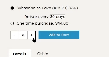
1. Reordering the Recharge Options
In the design you provided, the Subscription option is first. To accomplish this, enter the Layers tab. Locate the Recharge element and the “subscription-wrapper” and “one-time-purchase wrapper” layers. Click and drag the “subscription-wrapper” layer so that a blue line appears above the “one-time-purchase-wrapper” layer and drop it into place. These layers should now appear at the same level, with the subscription wrapper above the one-time-purchase wrapper.
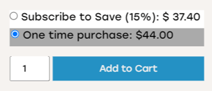
2. Set “Subscribe to Save” as the default selection
To edit the default selection between sub and one-time purchases, we will need to add a line of code to the ReCharge template. To start, double-click the ReCharge template so that it is highlighted on the page. Click Edit > Show Advanced (the first one) > Edit Custom JS/CSS. On a new line in the JS panel, declare the state.suscriptionActive value as true: state.subscriptionActive = true;
3. Create custom radio dots
The mockup provided has custom radio dots that are filled with a solid color when selected and transparent when out of focus. We can create custom radio dots with Builder’s Binding functionality.
To start designing, let’s place an empty Box element between the default radio button and the label for the subscription. This can be done from the Insert tab. Click and drag a Box element over the Layers tab, then drop it into place between the input and label layers.
Next, let’s style this box. In the Style tab, give the Box a fixed width and height of 15px. Open the Border section and set the border to Solid, black, 2px, with a radius of a very high number (this will make the Box a circle!).
At this point, it might be a good idea to rename this button before continuing. To do so, just double-click the layer in the Layers tab and type a new name.
You may notice that the Subscription wrapper layer is displaying each element on a new line, rather than in a row. To fix this, we can group these layers and set a layout option for them. In the L.ayers tab, hold down Shift and select the “subscription-input”, “custom radio”, and “subscription label” layers. Right-click on the selected layers and choose “Group Layers”. With the new group selected, head to Style > Child Layout. Choose the “Row” button. Under the “Align Children” dropdown, select “center”.
You should have something that looks like this. If not, check to see if any items have any extra margin applied.
3.5 Add interactivity to the radio dots
Click the Box that represents the radio dot.
Next, let’s head to the Data tab. Create a new “Element Data Binding”. In the “Get” box, type style.backgroundColor to bind to the background color of the Custom Radio layer. Then, in the From input, type the following code:
state.subscriptionActive ? 'black' : 'transparent';
This code checks if the subscription option is active. If it is, the color of the button will be filled with solid black. Otherwise, the button will be left with a transparent background.
Finally, let’s copy this radio button to the one-time-purchase wrapper. Some adjustments may be needed, such as setting the one-time-purchase container with the same layout styles (row, align children center).
You will also need to edit the binding statement so that the colors are reversed:
state.subscriptionActive ? 'transparent' : 'black'
3.75 Hide the original radio buttons and background colors
For the subscription and one-time-purchase wrappers, select the input layer that represents the original radio button. Rather than deleting these, we will just hide them from view. Just head to Style > Visibility and hide the original radio button on all devices.
To remove the light/dark backgrounds from the subscription options, select the subscription or one-time-purchase wrappers and head to the Data tab. You will see a binding there that controls the background color of these containers. You can delete this binding for both layers.
For the label of the subscription and one-time purchase, I added a margin of 7px on top and 12px to the left.
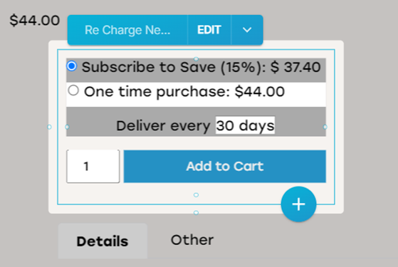
Here are the final custom radio buttons.

4. Quantity Selector plus/minus buttons
To create this, we will again need some bindings and dynamic data, as well as some clever style tricks.
Start by dropping a new box into the add-to-cart container, above the add-to-cart button in the Layers tab. I named it “Quantity Container”. I went to Style and selected a Row Child Layout. I also deleted the quantity-input layer, since we’ll be making a custom one.
Inside the Quantity Container, I placed a Box. In the Style tab, I set the following:
**Layout:**
Width: 38px
Height 38px

**Child Layout:**
Justify Content > Center
Align Children > Center

**Background:**
Fill Color: White

**Border:**
Border Style: Solid
Border Color: Black
Border Size: 2px
Then, I placed text into this box. I deleted all margins and set the value of the text to a minus sign.
I then duplicated this box twice to create a row of three boxes. For the first box, I added a right margin of -2px so the outline was overlapping with the next box. In the middle box, I set the text value to a number one. In the last box, I set the left margin to -2px to overlap the outline of the middle box. I set the text value to a plus sign.
Now that this element is styled, let’s make it interactive!
Dynamic Quantity Number:
Start by selecting the text box for the number box. Under Data > Element Data Bindings, create a Text binding. Set the logic to “from” state.quantity || 1. This will return either the current value of the selected quantity or default to 1.
Dynamic -/+:
Select the containing boxes for the plus and minus signs. Let’s help the user understand that these are intended to be clicked. Under Style > CSS Properties, add a new value and call it “cursor”. Set its value to “pointer”.
Next, let’s set some functionality. Select the containing box for the plus sign and head to Data > Element Events. Create a new event and set it to “click”. Click “Edit Action” > “+ Action” > “Custom Code”. In the custom code box that appears, write state.quantity++;. This line of code will add one to the current selected quantity when the plus sign box is clicked.
Select the containing box for the minus sign and head to Data > Element Events. Create a new event and set it to “click”. Click “Edit Action” > “+ Action” > “Custom Code”. In the custom code box that appears, write state.quantity > 0 ? state.quantity-- : state.quantity = 1;. This line of code will check the current quantity and allow it to be decreased if it is not already at 1.
5. Style Extras
Let’s style a few last items for a final polish!
In the Layers tab, select the “add-to-cart-button” layer and set its background color to black. Select the text box inside the Cart button and retype the text in all-caps.
Select the “add-to-cart-container” layer and right-click. Choose “Group Selection”. In the resulting new box, place a text element inside it, and above the “add-to-cart-container” layer. Set it to left-align the text and write “Quantity”.
And here is a look at the final design:
I hope this was helpful!
Thanks,
Logan from Builder.io


 Let me know if you see that happen again and we’ll investigate! The binding for the “minus” button was written as
